Login and registration
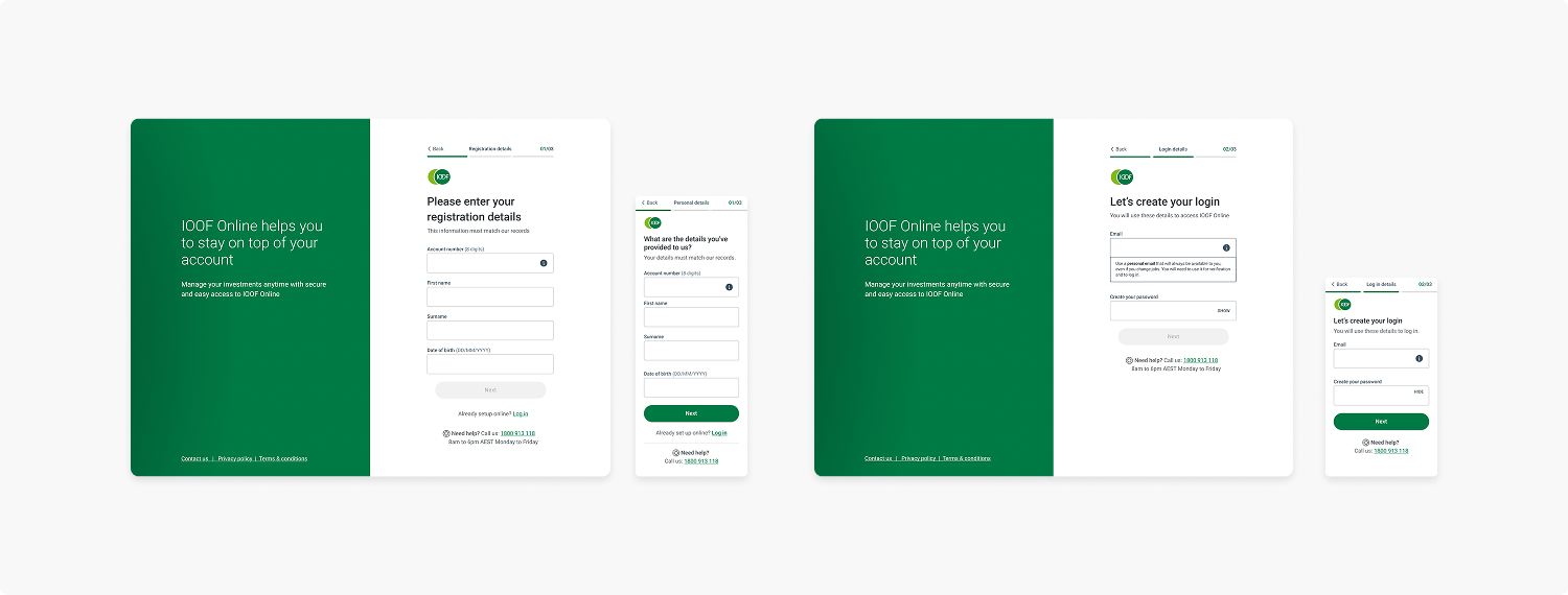
Designed and uplifted the existing login, forgot password and registration journey which allowed a plan for future growth and migration across multiple badges.
Role: Lead UX Designer
Collaborators: UX Design, Product Owners, Business Analysts, Product Experience, Content Management, Delivery Team, Legal
—
+15% Increased Online Registration
+10% Portfolio Logins
-17% Reduced Support Calls
OVERVIEW
Hypothesis
Due to the technological uplift via Auth0 (a new secure access), we had an opportunity to address some of the known issues around our login and registration pages, as well as make significant improvements to the overall flows for login and registration and plan for future growth.
Challenges and issues
Through there were many existing problems, user interface issues and lack of help for users created multiple pain points.
We experienced a high level of support calls relating to known issues for both login and registration.
Mergers, acquisitions, and legacy products have led to a confused misaligned customer journey.
There was no clear navigation to reach the login or account registration destinations.
Lack of hierarchy, there were multiple instances of register and login buttons that took you to different destinations.
Legacy accessibility issues across the platform caused by poor design practice and development.
User and Business benefits
USER NEED
Allow for ease of use in navigation and self service, providing help at the point of contact if required.
Streamline the journey from the beginning to end with no requirement of contacting support.
BUSINESS NEED
Having a reduction in calls to our support centre regarding issues with login and registration by allowing ease of use in terms of navigation and self service.
This could then be used as a foundation and allow the design ecosystem and other badges to align to our login and registration methods.
Who are we solving this for?
PRIMARY
New clients suffered the most common problems of all login and registration flows. It was not clear on what information they required or what they would need to do in context.
Existing clients would not remember many things such as their username or passwords. Due to low engagement on a long term product such as superannuation, there were minimal ways to self-service through a digital channel without having to call the support team.
SECONDARY
Independent advisers may only visit the platform annually, this could have caused potential friction and break the promise of service. Weighing in if the friction is greater than the product itself.
Dealership groups simply have a high expectation for the ease of business.
Licensees expect an opportunity to impress and provide more for onboarding material.
Risks and assumptions
At the time, I assumed…
That users would know what product they actually have
Simplifying the navigation solves most of the existing problems.
I also called out some risks such as…
We could be designing solutions not facilitated via the Auth0 secure access platform.
We may provide solutions that have not accommodated future identity changes.
Job stories
PRIMARY
When I receive my welcome pack to my new financial product, I want to easily find my way to the destination I am advised to got to, so I can complete any of the requirements easily and gain access to my new product.
—
SECONDARY
When I need to gain access to my new product and understand that I must register to gain access, I want to be tasked to complete the minimum amount actions and be led through a common registration process as per my previous experiences with other products that require me to do such tasks, so I can experience as little friction accessing my product that I am paying for after all.
RESEARCH
Research methods
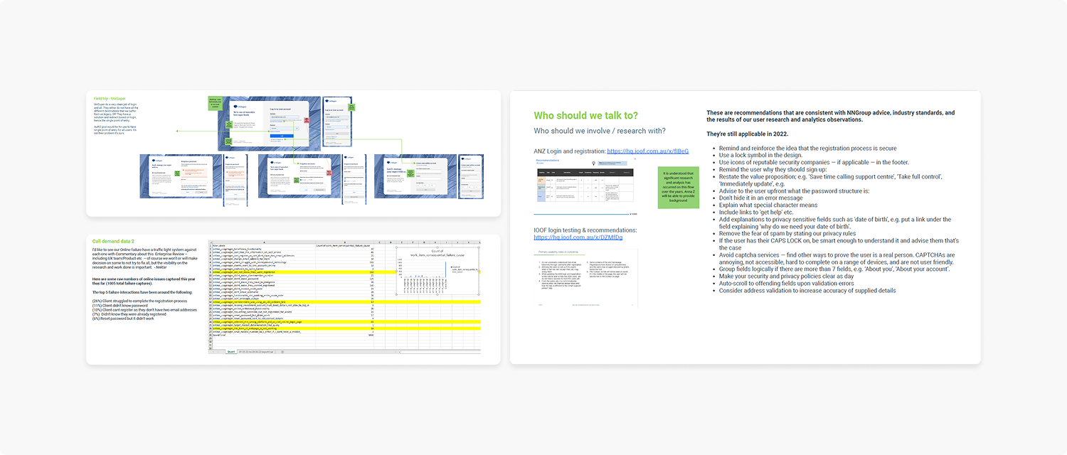
The research revealed that our users struggled and were overwhelmed with options and steps during their journey whether they were registering, logging in or simply retrieving a lost password. These insights allowed us to prioritise the main pain points. We were lucky enough to already have a related user testing research from a previous project, as well as coupling it with competitive analysis and call demand data.
What were our users saying?
We had previously ran user testing on our login and registration pages, some of the main pain points showcased our users lost without context on the existing pages.
1 “Where can I find my account number?”
2 “I don’t know what email I used when I registered”
3 “I didn’t even know I was already registered”
4 “I don’t know my password”
Call demand data
The 3 main support calls received were around login and registration.
Majority of online failures were also surrounding the same flow.
1 Didn’t know they were registered.
2 Didn’t know they had not registered yet.
3 Didn’t know their password.
26% Client struggled to complete registration
11% Client didn’t know password
10% Client couldn’t register as they don’t have two email addresses
7% Didn’t know they were already registered
6% Reset password but it didn’t work
IDEATION
Initial ideas
Our ideas would attempt to cover the touchpoints of navigation and usability of the existing forms, some of these included:
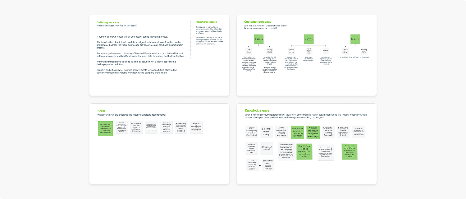
A single entry point for all users to simplify navigation, this could be differentiated using their login credentials.
The contact us section could display Australian based opening times and time zones, with the addition of a phone number link saving extra clicks.
Taking into account and learning from Material design research into their adaptive text field performance.
Addressing any existing accessibility issues.
Introduce ways to inform users that they are registered or to find the relevant information.
Reviewing the flow
I was able to utilise insights from a previous project that covered the login and registration pages. We were already aware of several issues relating to this flow and can took the opportunity to rectify these for some small wins.
Recommendations
Recommendations covering design enhancements, hierarchy, accessibility and pre-filled data were supplied to the team to take into account. What could ‘good’ look like?


Small but valuable wins
Tooltips & Steppers
Educating users in context of the most common pain points such as “What is my username?” and “What is my account number”
Steppers provide expectation, letting a user know where they are and how much more they need to do in a ‘boring’ journey helps them complete it.

Destination mapping
With the a removal of the login landing page, I was able to map all the login pages with just one dropdown menu. The page was deemed redundant and now the login is accessible through a main entry point.

Badge personality
Using one-third of the login, registration and forgot password pages to add badge personality and utilise opportunity to cross promote or incidentally talk to the users which effectively results in reducing noise without loss of personality. This provides clear space for the user to think and digest their next actions.

THE SOLUTION

An easy-to-use journey
I solved the issue of unnecessary calls across clients, advisers, dealership groups and licensees. A streamlined flow to the login, registration and forgot your password flow was evident through increased online registrations, more users online and less passwords requested.
The navigation was simplified to have one main entry point and each error and issue was handled in context providing the information and next steps required. We were able to provide help and options, and even steps, so users would know exactly where they are.
With the UI uplift, we built more personality on the pages to allow for a more personal connection with the users and create a foundation for the various badges and future growth.