
Rate of return
Led the experience design in building a foundation for IOOF’s portfolio performance graphs, reporting and statements.
Role: Lead UX Designer
Collaborators: UX Design, Product Owners, Business Analysts, Product Experience, Delivery Team
—
+5% Online Client Usage
+3% Increased Adviser & Client Interaction
-5% Reduced Support Calls
OVERVIEW
Hypothesis
Uplifting the existing summary display and introducing a portfolio performance will allow for transparency and improve the self service and flexibility for the Advisers and Clients.
What were the existing problems?
Besides feature parity, we had clear issues that needed to be improved.
The existing on-page graphs were not flexible in displaying performance or fees, two important features that users are looking for in their superannuation and investments.
We had reports that could be generated with these details, but they were inconsistent between our two types of users in Advisers and Clients.
There were potential issues around declaring comparative performances.
Inconsistencies in terms used, naming and general language.

The risks and assumptions
We had assumptions about the user perspective and behaviour which would allow us to further research and user test. We thought that the...
User perspective would be to have all fees excluded from their performance.
Majority of users wouldn’t care about the calculation method.
Investor personas would already know the benchmarks, and wouldn’t require comparative performance.
We could be displaying different numbers in our calculation, this could be a legal issue
Value and delight
Being able to provide flexibility in our graphs would enable our users to view their performance with detail and transparency.
With that flexibility, it would allow for users to self-serve which in turn, reduces their calls to our support centre. Introducing and delivering these features with consistency would provide us with a competitor advantage.
Knowledge gaps
Further to the risks and assumptions, there were many questions about what the users really needed.
What fees are we needing to include or exclude?
Who wants to know about these fees and why?
Are there differences between a super and non-super account?
Is the focus on balance or performance?
How are we calculating this performance? Do people care?
IDEATION
Initial ideas
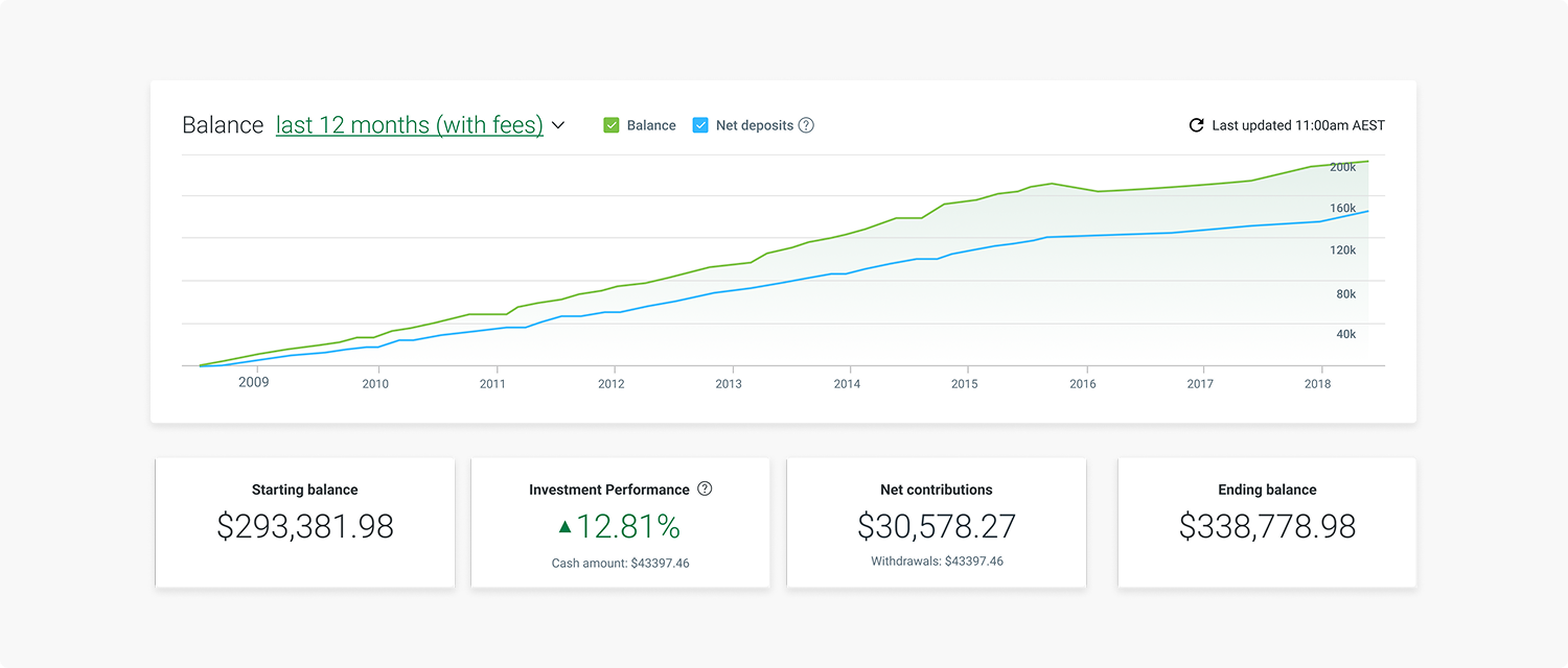
Utilising our existing features, some initial ideas that were proposed were to uplift the existing graphs and reporting, to introduce detailed performance tabs and to provide further assistance to Advisers and Clients with their reporting and calculation methods.
WORKSHOPPING
Unpacking workshop
I ran and facilitated a UX unpacking workshop to get more of the team involved and bridge the gap between all stakeholders. The purpose of the session was to answer any questions, hear more ideas and iterate and improve the concepts together. I prepared a few activities with the most successful being the dot voting session. We were able to review and set out clear steps before proceeding to set up our adviser survey.

USER TESTING
What were we testing?
Current nLink (MLC platform) users have an ability to review the tax implications of their trades and download the CGT report to access more tax details. They have access to FIFO and HCFO tax optimisation methods and can choose parcels that they're willing to sell when completing the trade.
We want to introduce the tax optimisation features on the Expand platform, too, but we have several risky assumptions we're willing to test before delivering the designs.
What were we trying to find out?
How critical is it to the users to see the parcels and be able to select them when trading?
Will the three methods we're offering be enough?
Is it ok that we're allowing the users to change the tax optimisation only on the account, not the trade level?
How discoverable is the method change 'switch'?
Does the information about trade implications make sense?
Survey testing
We tested 24 adviser participants using Survey Monkey with 45 questions on
17 pages. We presented each adviser with questions and screenshots from our concepts. It had an approximate 26 minute completion time.
We tested in 6 categories.
1 Adviser Workflow
2 Client View
3 Charting and display
4 Fees inclusion
5 Benchmarking
6 Reporting

Remote user testing
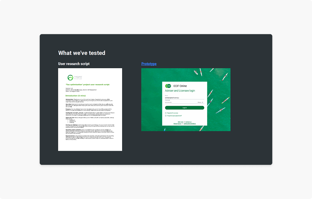
We conducted a remote usability research of one-on-one user interviews held over Zoom with a user researcher, notetaker and several muted observers present. All notes are taken in Miro, tagged, clustered by trends and analysed.
We talked to 5 financial partners and advisers.

What didn’t work well?
1 It was not clear to users that they were making changes on a trade level rather than their individual share level.
2 Users that were not familiar with the platform had a hard time understanding navigation and where to go to change the tax method.
3 New users don’t know where to find the specific CGT impact report.
What worked well?
1 The provided 3 tax method options were more than enough as these covered majority of their needs.
2 FIFO is a great default that is easy to understand and is accepted by all users as their first option.
3 Changing the tax method is not an everyday task or need. Users claimed they rarely change it.
4 The tax optimisation method dropdown options worked well as they were sufficient and clear to the users, an accordion with a detailed description was not required.
5 The existing platform had a clear flow and process that was understood well by new users.
6 If parcels were to be introduced, users are very keen and was met with great enthusiasm.
THE SOLUTION

A detailed, transparent performance tool
We were able to build an experience that allowed Advisers to have an efficient, relevant overview of their Client’s account, improving their workflow and gained a competitive edge in further use of the platform.
Clients are able to gain an understanding and transparency of what is really happening with their money and performance.
Improved the existing balance over time graph by displaying a detailed summary, built a tab for account performance and periodic performance and further options within reporting.
The interface was also uplifted to be consistent across Advisers (when viewing the clients account) and the Client’s own view.


